CSS 制作滚动切换文字
[vc_row][vc_column][woodmart_text_block woodmart_css_id=”64a23333279aa” woodmart_inline=”no” responsive_spacing=”eyJwYXJhbV90eXBlIjoid29vZG1hcnRfcmVzcG9uc2l2ZV9zcGFjaW5nIiwic2VsZWN0b3JfaWQiOiI2NGEyMzMzMzI3OWFhIiwic2hvcnRjb2RlIjoid29vZG1hcnRfdGV4dF9ibG9jayIsImRhdGEiOnsidGFibGV0Ijp7fSwibW9iaWxlIjp7fX19″ parallax_scroll=”no” wd_hide_on_desktop=”no” wd_hide_on_tablet=”no” wd_hide_on_mobile=”no”]有三种主要类型的文本旋转:
1. rotateX – 这是沿着X轴(水平轴)旋转。可以想象成在X轴上沿水平翻转文本。
2. rotateY – 这是沿着Y轴(垂直轴)旋转。可以想象成在Z轴上沿水平翻转文本。
3. rotateZ – 这是围绕Z轴(depth 轴)旋转。可以想象成绕着文本本身的轴心旋转。
正值度数表示顺时针旋转,负值度数表示逆时针旋转。
例如:
– transform: rotateX(180deg); 表示围绕X轴180°顺时针旋转
– transform: rotateY(-90deg); 表示围绕Y轴90°逆时针旋转
– transform: rotateZ(45deg); 表示围绕Z轴45°顺时针旋转[/woodmart_text_block][/vc_column][/vc_row][vc_row][vc_column][vc_column_text woodmart_inline=”no” text_larger=”no”]
Html部分
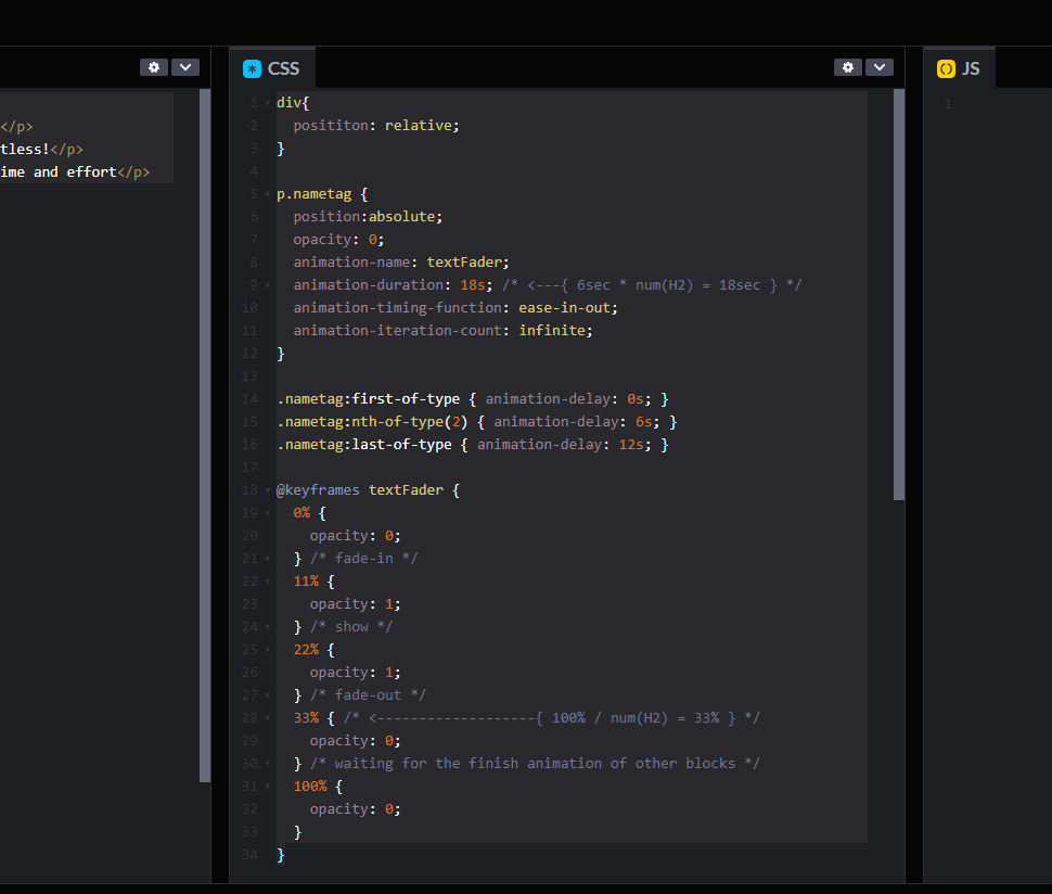
<div class="box">
<p class="mloun">Wordpress外贸建站</p>
<p class="mloun">外贸独立站</p>
<p class="mloun">Wordpress独立站建站</p>
</div>
CSS部分
.box{
position: relative;
}
p.mloun{
position:absolute;
opacity: 0;
animation-name: textFader;
animation-duration: 9s; /* <---{ 6sec * num(H2) = 18sec } */
animation-timing-function: ease-in-out;
animation-iteration-count: infinite;
}
.mloun:first-of-type { animation-delay: 0s; }
.mloun:nth-of-type(2) { animation-delay: 3s; }
.mloun:last-of-type { animation-delay: 6s; }
@keyframes textFader {
0% {
opacity: 0;
} /* fade-in */
11% {
opacity: 1;
} /* show */
22% {
opacity: 1;
} /* fade-out */
33% { /* <-------------------{ 100% / num(H2) = 33% } */
opacity: 0;
} /* waiting for the finish animation of other blocks */
100% {
opacity: 0;
}
}
[/vc_column_text][/vc_column][/vc_row][vc_row][vc_column][vc_column_text woodmart_inline=”no” text_larger=”no”]
效果预览
[/vc_column_text][/vc_column][/vc_row][vc_row css=”.vc_custom_1688351428841{padding-top: 0px !important;padding-right: 0px !important;padding-bottom: 100px !important;padding-left: 0px !important;}” woodmart_css_id=”64a232bd8f8bb” responsive_spacing=”eyJwYXJhbV90eXBlIjoid29vZG1hcnRfcmVzcG9uc2l2ZV9zcGFjaW5nIiwic2VsZWN0b3JfaWQiOiI2NGEyMzJiZDhmOGJiIiwic2hvcnRjb2RlIjoidmNfcm93IiwiZGF0YSI6eyJ0YWJsZXQiOnt9LCJtb2JpbGUiOnt9fX0=” mobile_bg_img_hidden=”no” tablet_bg_img_hidden=”no” woodmart_parallax=”0″ woodmart_gradient_switch=”no” woodmart_box_shadow=”no” wd_z_index=”no” woodmart_disable_overflow=”0″ row_reverse_mobile=”0″ row_reverse_tablet=”0″][vc_column][vc_raw_html]JTNDZGl2JTIwY2xhc3MlM0QlMjJib3glMjIlM0UlMEElMjAlMjAlMjAlMjAlM0NwJTIwY2xhc3MlM0QlMjJtbG91biUyMiUzRVdvcmRwcmVzcyVFNSVBNCU5NiVFOCVCNCVCOCVFNSVCQiVCQSVFNyVBQiU5OSUzQyUyRnAlM0UlMEElMjAlMjAlMjAlMjAlM0NwJTIwY2xhc3MlM0QlMjJtbG91biUyMiUzRSVFNSVBNCU5NiVFOCVCNCVCOCVFNyU4QiVBQyVFNyVBQiU4QiVFNyVBQiU5OSUzQyUyRnAlM0UlMEElMjAlMjAlMjAlMjAlM0NwJTIwY2xhc3MlM0QlMjJtbG91biUyMiUzRVdvcmRwcmVzcyVFNyU4QiVBQyVFNyVBQiU4QiVFNyVBQiU5OSVFNSVCQiVCQSVFNyVBQiU5OSUzQyUyRnAlM0UlMEElM0MlMkZkaXYlM0U=[/vc_raw_html][vc_raw_html]JTNDc3R5bGUlM0UlMEEuYm94JTdCJTBBJTIwJTIwcG9zaXRpb24lM0ElMjByZWxhdGl2ZSUzQiUwQSU3RCUwQSUwQXAubWxvdW4lN0IlMEElMjAlMjBwb3NpdGlvbiUzQWFic29sdXRlJTNCJTBBJTIwJTIwb3BhY2l0eSUzQSUyMDAlM0IlMEElMjAlMjBhbmltYXRpb24tbmFtZSUzQSUyMG1sb3VuMSUzQiUwQSUyMCUyMGFuaW1hdGlvbi1kdXJhdGlvbiUzQSUyMDlzJTNCJTIwJTJGJTJBJTIwJTNDLS0tJTdCJTIwNnNlYyUyMCUyQSUyMG51bSUyOEgyJTI5JTIwJTNEJTIwMThzZWMlMjAlN0QlMjAlMkElMkYlMEElMjAlMjBhbmltYXRpb24tdGltaW5nLWZ1bmN0aW9uJTNBJTIwZWFzZS1pbi1vdXQlM0IlMEElMjAlMjBhbmltYXRpb24taXRlcmF0aW9uLWNvdW50JTNBJTIwaW5maW5pdGUlM0IlMEElN0QlMEElMEEubWxvdW4lM0FmaXJzdC1vZi10eXBlJTIwJTdCJTIwYW5pbWF0aW9uLWRlbGF5JTNBJTIwMHMlM0IlMjAlN0QlMEEubWxvdW4lM0FudGgtb2YtdHlwZSUyODIlMjklMjAlN0IlMjBhbmltYXRpb24tZGVsYXklM0ElMjAzcyUzQiUyMCU3RCUwQS5tbG91biUzQWxhc3Qtb2YtdHlwZSUyMCU3QiUyMGFuaW1hdGlvbi1kZWxheSUzQSUyMDZzJTNCJTIwJTdEJTBBJTBBJTQwa2V5ZnJhbWVzJTIwbWxvdW4xJTdCJTBBJTIwJTIwMCUyNSUyMCU3QiUwQSUyMCUyMCUyMCUyMG9wYWNpdHklM0ElMjAwJTNCJTBBJTIwJTIwJTdEJTIwJTJGJTJBJTIwZmFkZS1pbiUyMCUyQSUyRiUwQSUyMCUyMDExJTI1JTIwJTdCJTBBJTIwJTIwJTIwJTIwb3BhY2l0eSUzQSUyMDElM0IlMEElMjAlMjAlN0QlMjAlMkYlMkElMjBzaG93JTIwJTJBJTJGJTBBJTIwJTIwMjIlMjUlMjAlN0IlMEElMjAlMjAlMjAlMjBvcGFjaXR5JTNBJTIwMSUzQiUwQSUyMCUyMCU3RCUyMCUyRiUyQSUyMGZhZGUtb3V0JTIwJTJBJTJGJTBBJTIwJTIwMzMlMjUlMjAlN0IlMjAlMkYlMkElMjAlM0MtLS0tLS0tLS0tLS0tLS0tLS0tJTdCJTIwMTAwJTI1JTIwJTJGJTIwbnVtJTI4SDIlMjklMjAlM0QlMjAzMyUyNSUyMCU3RCUyMCUyQSUyRiUwQSUyMCUyMCUyMCUyMG9wYWNpdHklM0ElMjAwJTNCJTBBJTIwJTIwJTdEJTIwJTJGJTJBJTIwd2FpdGluZyUyMGZvciUyMHRoZSUyMGZpbmlzaCUyMGFuaW1hdGlvbiUyMG9mJTIwb3RoZXIlMjBibG9ja3MlMjAlMkElMkYlMEElMjAlMjAxMDAlMjUlMjAlN0IlMEElMjAlMjAlMjAlMjBvcGFjaXR5JTNBJTIwMCUzQiUwQSUyMCUyMCU3RCUwQSU3RCUwQSUwQSUzQyUyRnN0eWxlJTNF[/vc_raw_html][/vc_column][/vc_row][vc_row][vc_column][woodmart_text_block woodmart_css_id=”64a231a51d05f” woodmart_inline=”no” responsive_spacing=”eyJwYXJhbV90eXBlIjoid29vZG1hcnRfcmVzcG9uc2l2ZV9zcGFjaW5nIiwic2VsZWN0b3JfaWQiOiI2NGEyMzFhNTFkMDVmIiwic2hvcnRjb2RlIjoid29vZG1hcnRfdGV4dF9ibG9jayIsImRhdGEiOnsidGFibGV0Ijp7fSwibW9iaWxlIjp7fX19″ parallax_scroll=”no” wd_hide_on_desktop=”no” wd_hide_on_tablet=”no” wd_hide_on_mobile=”no”]
文本翻转效果
要实现以文本垂直翻转,可以增加:ransform: rotateX(0deg)
例如
@keyframes textFader {
0% {
opacity: 0;transform: rotateX(0deg);
} /* fade-in */
11% {
opacity: 1;transform: rotateX(-40deg);
} /* show */
22% {
opacity: 1;transform: rotateX(90deg);
} /* fade-out */
33% { /* <-------------------{ 100% / num(H2) = 33% } */
opacity: 0;
} /* waiting for the finish animation of other blocks */
100% {
opacity: 0;
}
}
为了让翻转更加明显,我们需要在翻转文本的上一级增加透视CSS
box{perspective: 300px;}
要实现以文本底部作为倾斜轴来翻转文本,你可以这样做:
.mloun{transform-origin: bottom center;/* 以文本底部为原点 */}
[/woodmart_text_block][/vc_column][/vc_row][vc_row css=”.vc_custom_1688351439653{padding-top: 0px !important;padding-right: 0px !important;padding-bottom: 100px !important;padding-left: 0px !important;}” woodmart_css_id=”64a232cb01869″ responsive_spacing=”eyJwYXJhbV90eXBlIjoid29vZG1hcnRfcmVzcG9uc2l2ZV9zcGFjaW5nIiwic2VsZWN0b3JfaWQiOiI2NGEyMzJjYjAxODY5Iiwic2hvcnRjb2RlIjoidmNfcm93IiwiZGF0YSI6eyJ0YWJsZXQiOnt9LCJtb2JpbGUiOnt9fX0=” mobile_bg_img_hidden=”no” tablet_bg_img_hidden=”no” woodmart_parallax=”0″ woodmart_gradient_switch=”no” woodmart_box_shadow=”no” wd_z_index=”no” woodmart_disable_overflow=”0″ row_reverse_mobile=”0″ row_reverse_tablet=”0″][vc_column][vc_raw_html]JTNDZGl2JTIwY2xhc3MlM0QlMjJib3gyJTIyJTNFJTBBJTIwJTIwJTIwJTIwJTNDcCUyMGNsYXNzJTNEJTIybWxvdW4yJTIyJTNFV29yZHByZXNzJUU1JUE0JTk2JUU4JUI0JUI4JUU1JUJCJUJBJUU3JUFCJTk5JTNDJTJGcCUzRSUwQSUyMCUyMCUyMCUyMCUzQ3AlMjBjbGFzcyUzRCUyMm1sb3VuMiUyMiUzRSVFNSVBNCU5NiVFOCVCNCVCOCVFNyU4QiVBQyVFNyVBQiU4QiVFNyVBQiU5OSUzQyUyRnAlM0UlMEElMjAlMjAlMjAlMjAlM0NwJTIwY2xhc3MlM0QlMjJtbG91bjIlMjIlM0VXb3JkcHJlc3MlRTclOEIlQUMlRTclQUIlOEIlRTclQUIlOTklRTUlQkIlQkElRTclQUIlOTklM0MlMkZwJTNFJTBBJTNDJTJGZGl2JTNF[/vc_raw_html][vc_raw_html]JTNDc3R5bGUlM0UlMEEuYm94MiU3QiUwQXBlcnNwZWN0aXZlJTNBJTIwMzAwcHglM0IlMEElMjAlMjBwb3NpdGlvbiUzQSUyMHJlbGF0aXZlJTNCJTBBJTdEJTBBJTBBcC5tbG91bjIlN0Jmb250LXNpemUlM0E2NHB4JTNCJTBBdHJhbnNmb3JtLW9yaWdpbiUzQSUyMGJvdHRvbSUyMGNlbnRlciUzQiUwQSUyMCUyMHBvc2l0aW9uJTNBYWJzb2x1dGUlM0IlMEElMjAlMjBvcGFjaXR5JTNBJTIwMCUzQiUwQSUyMCUyMGFuaW1hdGlvbi1uYW1lJTNBJTIwbWxvdW4yJTNCJTBBJTIwJTIwYW5pbWF0aW9uLWR1cmF0aW9uJTNBJTIwOXMlM0IlMjAlMkYlMkElMjAlM0MtLS0lN0IlMjA2c2VjJTIwJTJBJTIwbnVtJTI4SDIlMjklMjAlM0QlMjAxOHNlYyUyMCU3RCUyMCUyQSUyRiUwQSUyMCUyMGFuaW1hdGlvbi10aW1pbmctZnVuY3Rpb24lM0ElMjBlYXNlLWluLW91dCUzQiUwQSUyMCUyMGFuaW1hdGlvbi1pdGVyYXRpb24tY291bnQlM0ElMjBpbmZpbml0ZSUzQiUwQSU3RCUwQSUwQS5tbG91bjIlM0FmaXJzdC1vZi10eXBlJTIwJTdCJTIwYW5pbWF0aW9uLWRlbGF5JTNBJTIwMHMlM0IlMjAlN0QlMEEubWxvdW4yJTNBbnRoLW9mLXR5cGUlMjgyJTI5JTIwJTdCJTIwYW5pbWF0aW9uLWRlbGF5JTNBJTIwM3MlM0IlMjAlN0QlMEEubWxvdW4yJTNBbGFzdC1vZi10eXBlJTIwJTdCJTIwYW5pbWF0aW9uLWRlbGF5JTNBJTIwNnMlM0IlMjAlN0QlMEElMEElNDBrZXlmcmFtZXMlMjBtbG91bjIlN0IlMEElMjAlMjAwJTI1JTIwJTdCJTBBJTIwJTIwJTIwJTIwb3BhY2l0eSUzQSUyMDAlM0J0cmFuc2Zvcm0lM0ElMjByb3RhdGVYJTI4MGRlZyUyOSUzQiUwQSUyMCUyMCU3RCUyMCUyRiUyQSUyMGZhZGUtaW4lMjAlMkElMkYlMEElMjAlMjAxMSUyNSUyMCU3QiUwQSUyMCUyMCUyMCUyMG9wYWNpdHklM0ElMjAxJTNCdHJhbnNmb3JtJTNBJTIwcm90YXRlWCUyOC00MGRlZyUyOSUzQiUwQSUyMCUyMCU3RCUyMCUyRiUyQSUyMHNob3clMjAlMkElMkYlMEElMjAlMjAyMiUyNSUyMCU3QiUwQSUyMCUyMCUyMCUyMG9wYWNpdHklM0ElMjAxJTNCdHJhbnNmb3JtJTNBJTIwcm90YXRlWCUyODkwZGVnJTI5JTNCJTBBJTIwJTIwJTdEJTIwJTJGJTJBJTIwZmFkZS1vdXQlMjAlMkElMkYlMEElMjAlMjAzMyUyNSUyMCU3QiUyMCUyRiUyQSUyMCUzQy0tLS0tLS0tLS0tLS0tLS0tLS0lN0IlMjAxMDAlMjUlMjAlMkYlMjBudW0lMjhIMiUyOSUyMCUzRCUyMDMzJTI1JTIwJTdEJTIwJTJBJTJGJTBBJTIwJTIwJTIwJTIwb3BhY2l0eSUzQSUyMDAlM0IlMEElMjAlMjAlN0QlMjAlMkYlMkElMjB3YWl0aW5nJTIwZm9yJTIwdGhlJTIwZmluaXNoJTIwYW5pbWF0aW9uJTIwb2YlMjBvdGhlciUyMGJsb2NrcyUyMCUyQSUyRiUwQSUyMCUyMDEwMCUyNSUyMCU3QiUwQSUyMCUyMCUyMCUyMG9wYWNpdHklM0ElMjAwJTNCJTBBJTIwJTIwJTdEJTBBJTdEJTBBJTBBJTNDJTJGc3R5bGUlM0U=[/vc_raw_html][/vc_column][/vc_row][vc_row][vc_column][woodmart_text_block woodmart_css_id=”64a232e5f2a05″ woodmart_inline=”no” responsive_spacing=”eyJwYXJhbV90eXBlIjoid29vZG1hcnRfcmVzcG9uc2l2ZV9zcGFjaW5nIiwic2VsZWN0b3JfaWQiOiI2NGEyMzJlNWYyYTA1Iiwic2hvcnRjb2RlIjoid29vZG1hcnRfdGV4dF9ibG9jayIsImRhdGEiOnsidGFibGV0Ijp7fSwibW9iaWxlIjp7fX19″ parallax_scroll=”no” wd_hide_on_desktop=”no” wd_hide_on_tablet=”no” wd_hide_on_mobile=”no”]原文章:https://codepen.io/AmitKKhanchandani/pen/jOvdmpX[/woodmart_text_block][/vc_column][/vc_row]